This site uses cookies
We use cookies to make your experience better. To comply with the new e-Privacy directive, we need to ask for your consent to set the cookies. Learn more.
![]()
The shortlisted award include:
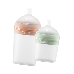
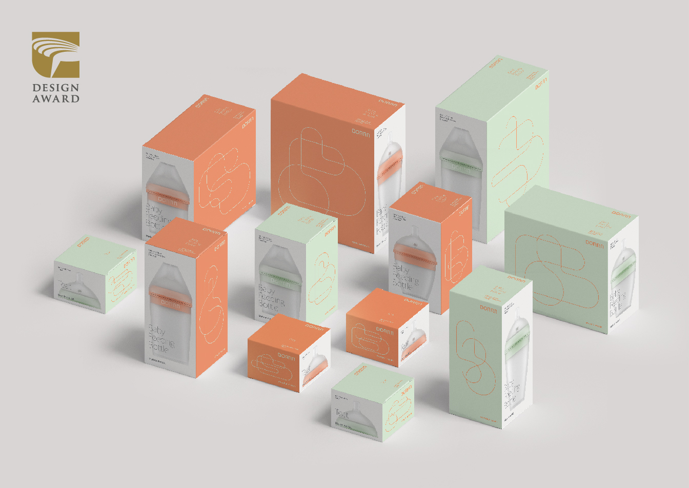
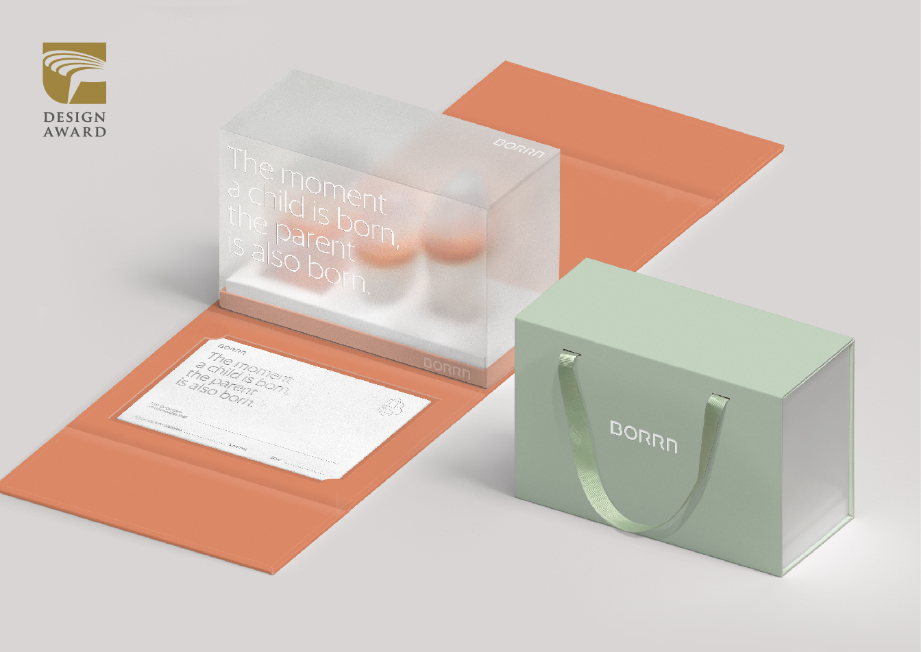
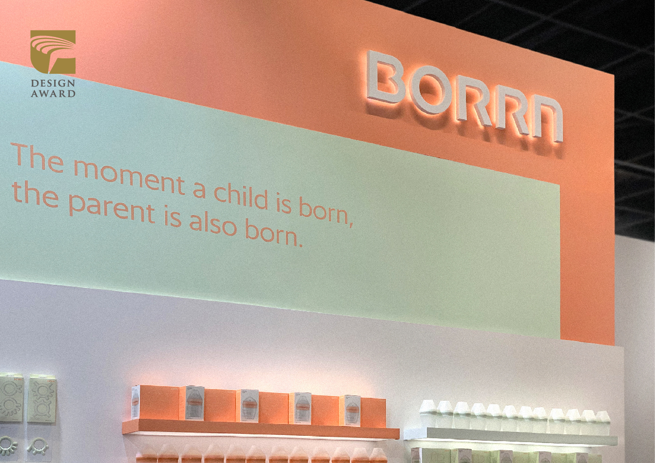
「BORRN」Logo
Categories: Communication Design
Subcategory: Corporate and brand identity
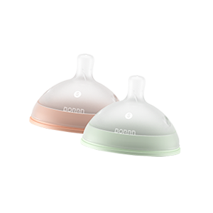
"The corporate identity design of BORRN consists of a logotype, a set of dynamic logo marks and a gender neutral color scheme.
BORRN’s logo is a visualisation of “B” and “b” in organic forms drawn with one continuous line, symbolising the connection between Parent and Child, and storylines of families. BORRN logo is dynamic and fluid, illustrating possibilities and uniqueness of every family."
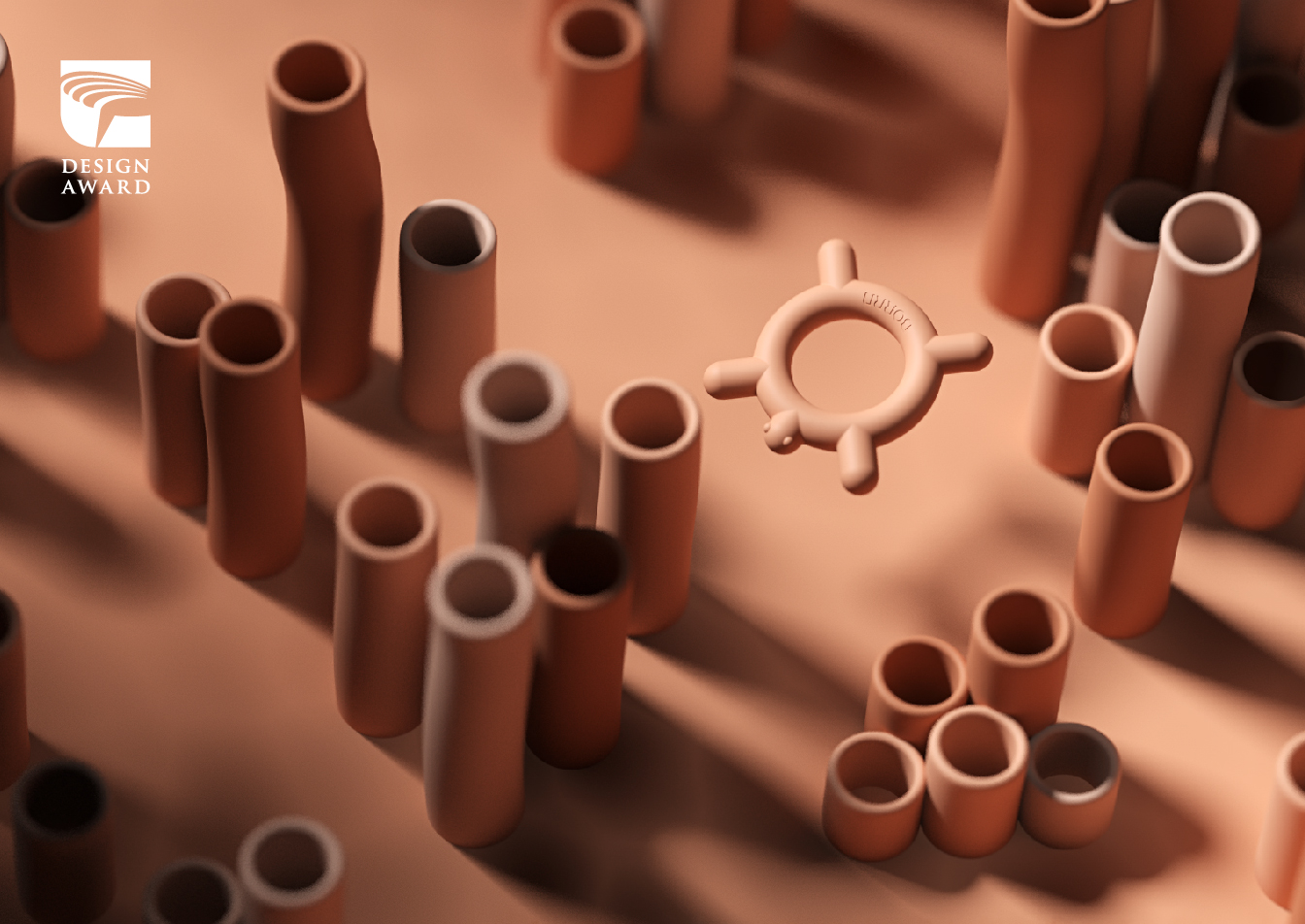
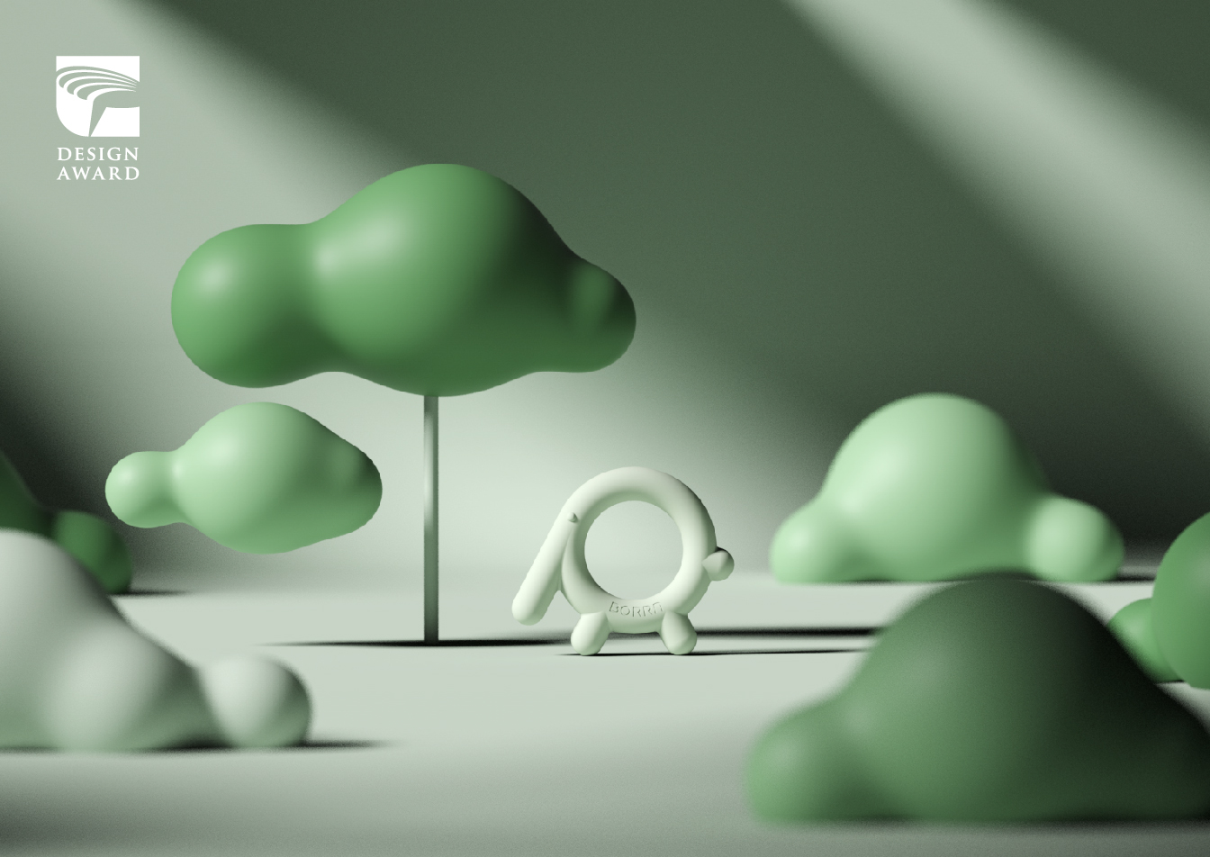
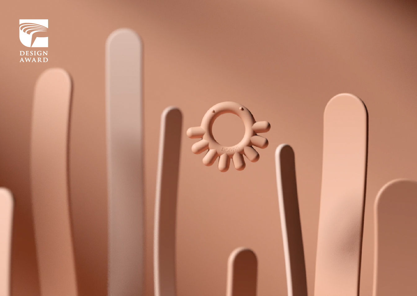
![]()
「BORRN Animal Teether Animation」
Categories: Communication Design
Subcategory: Animation
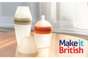
"BORRN is a brand from the UK for both parent and child. The 3D animation captures BORRN animals, such as little sheep and mini crab, roaming around their home and growing up happily. The content is simple, very mesmerizing and healing."